Bitmap Monogram
For this project I wanted to create a monogram design that held a certain level of professionalism to it. Using lines to break up the letters, while also giving relation between the three letterforms, I aimed to have the empty space in each letter almost look like its own shape, giving a more playful nature overall to this design. This design reflects my personal take on how I approach projects, maintaining a balance between my personal style and what I believe holds a level of what would be accepted in the real world.
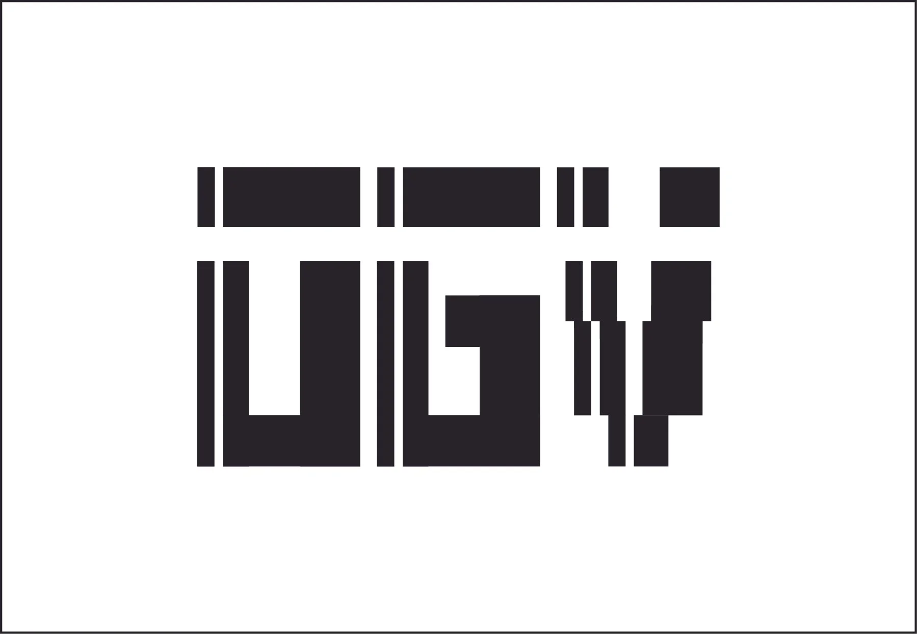
Old Design

The old design features more narrow letterforms and completely straight dividing lines regardless of which letterform said line is dividing.
reDesign
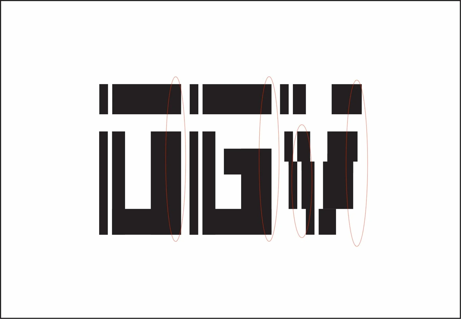
The new design sees the line continue along the shape of the V, building a stronger relationship between all three letterforms. All letterforms were also widened on their left side, giving more visual stability and form.

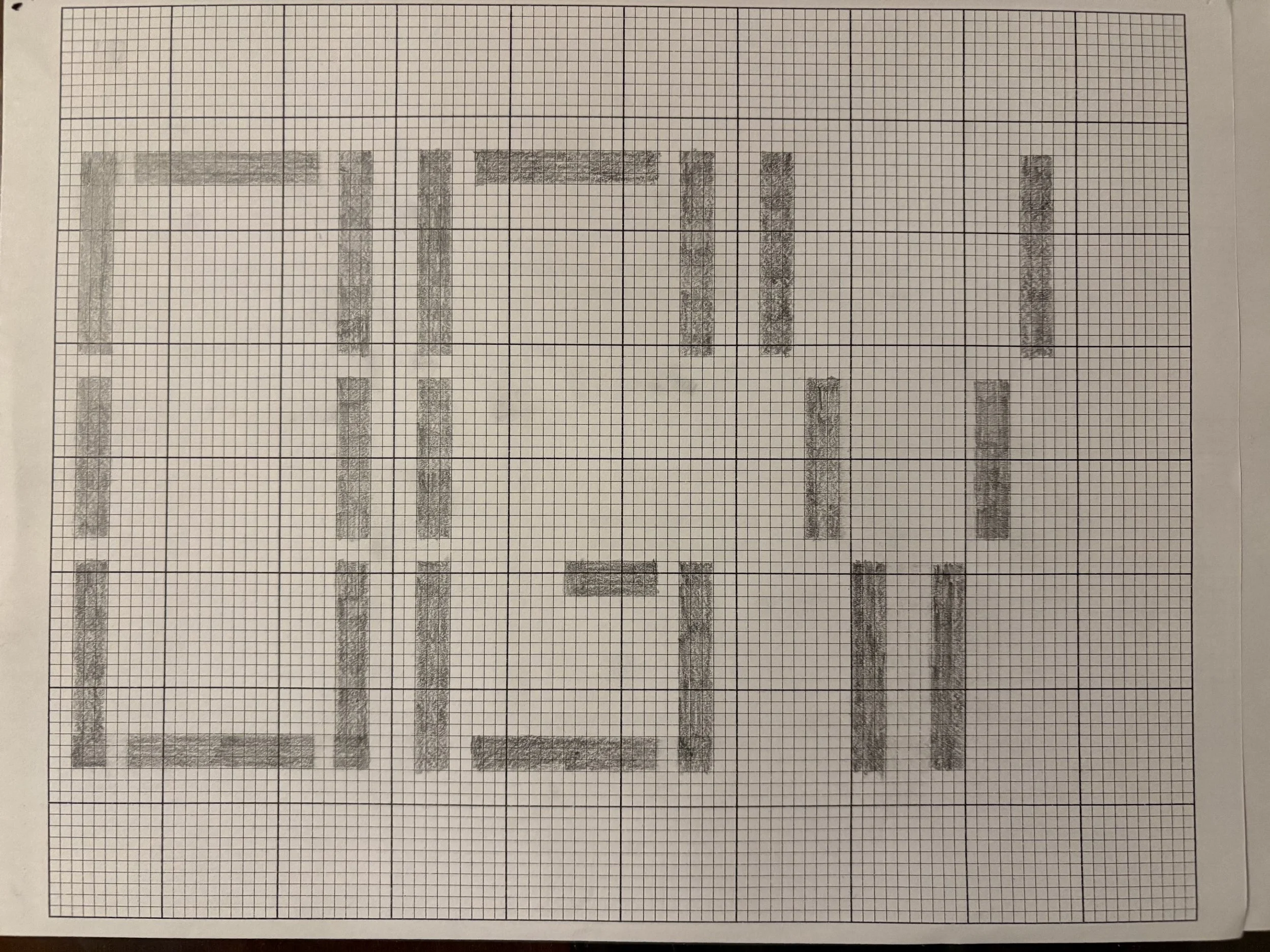
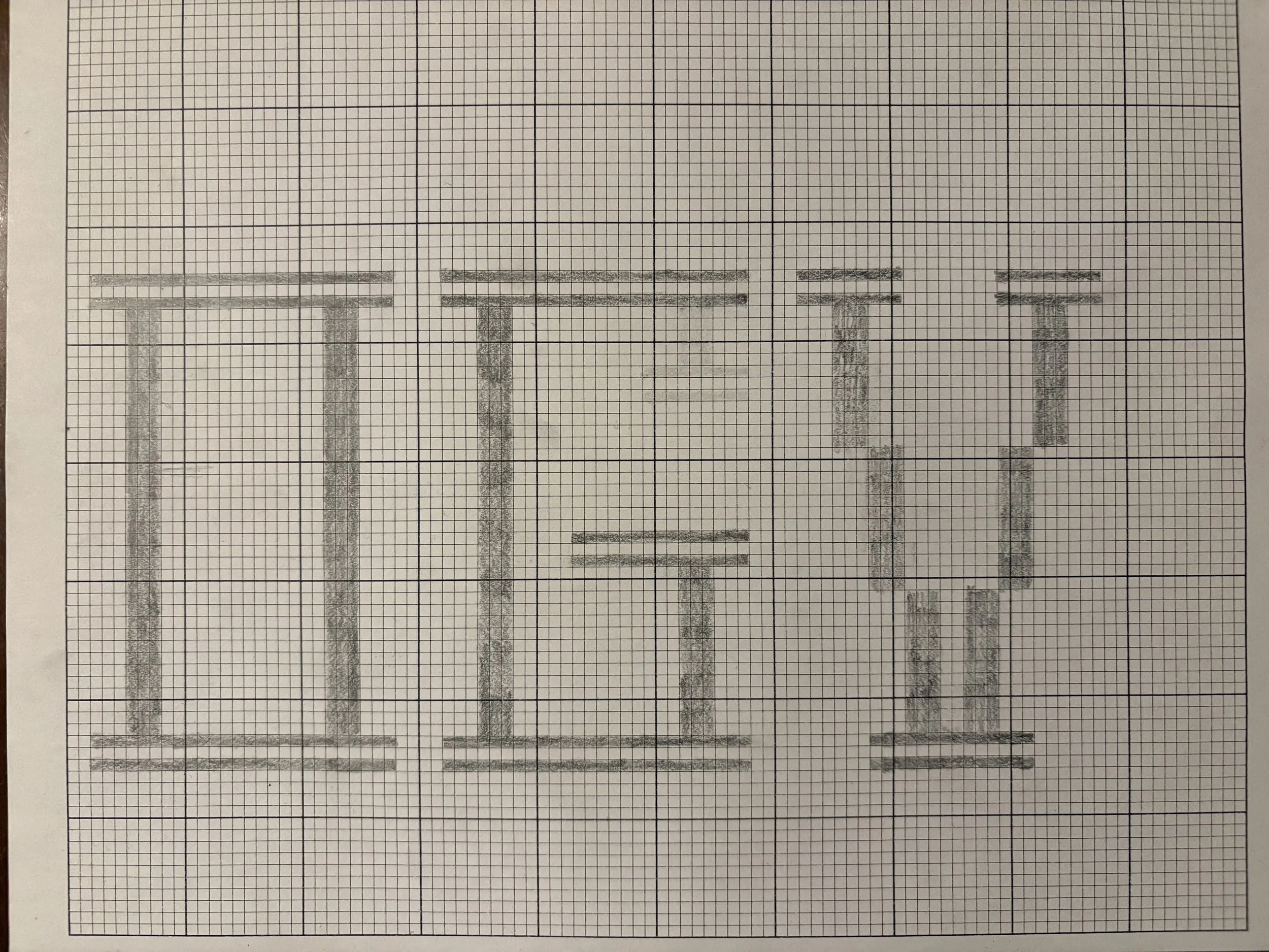
Pictured below is the project at multiple stages throughout its development.