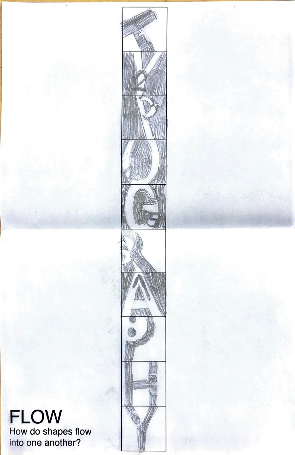
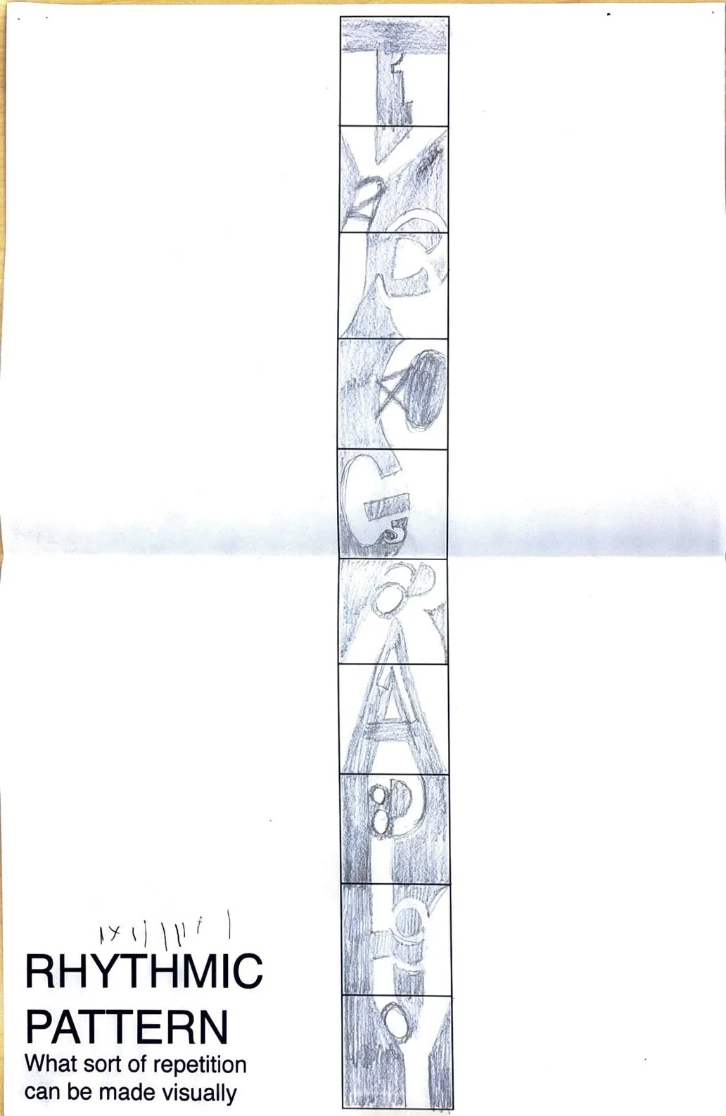
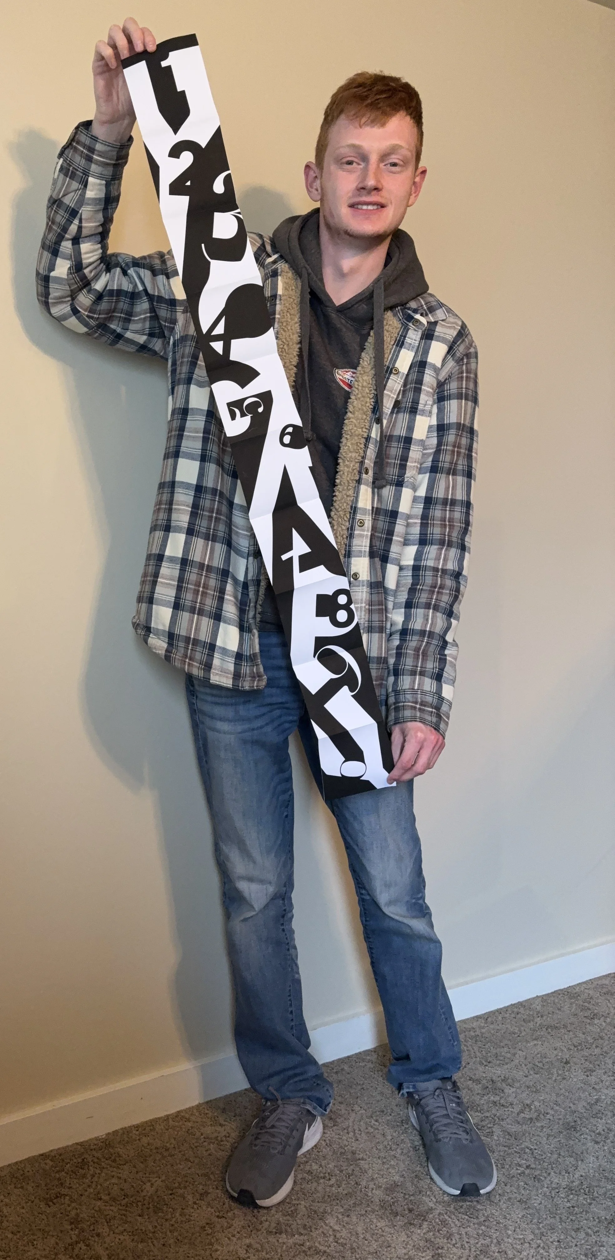
Sequential Figure Ground
My intention while creating this project was to keep the letters at a higher hierarchy than the numbers. Moreover I also wanted to keep a balance between black and white throughout the entire piece. I created a fluid transition between the letters. A drastic change in colors would break the flow that I wanted for this piece. I kept fluidity between the letters and numbers so it wouldn’t seem like any one letter or number was haphazardly placed. While we were restricted to keeping the numbers and letters in their respective boxes in a grid pattern, I made my letters uniformly flow into each other, making the entire piece feel connected with itself.

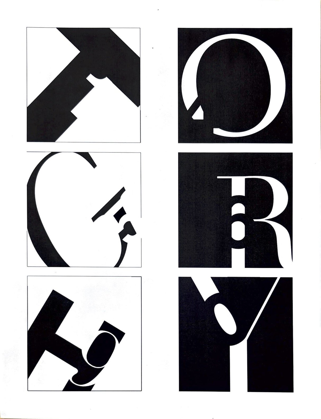
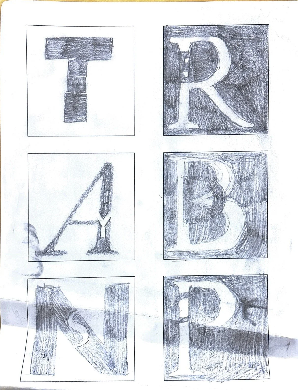
Old Design

The older version has unedited lines between letters are numbers, just being the letterforms themselves to create shapes. This leads to some rough angles throughout the whole design
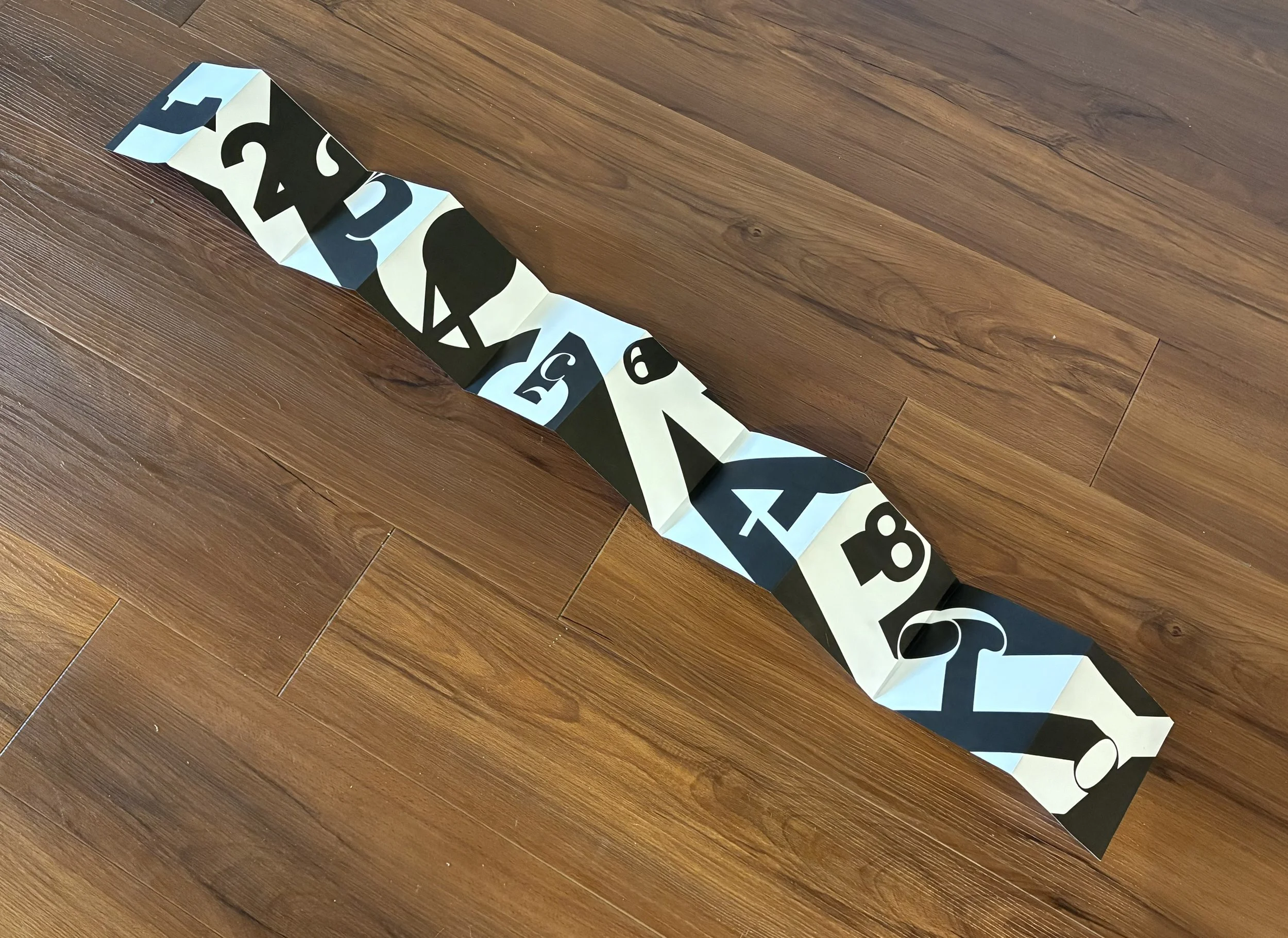
reDesign

In the new version, transitions between letters have been smoothed out for an easier viewing experience. The design remains mostly unchanged as not to disrupt the patterns at play throughout the entire piece.
Pictured below is the project at multiple stages throughout its development.