Typography Poster, Festival
For this project, I chose to make my poster for the festival of oranges, a gigantic and long food fight in Italy using primarily oranges and representing the common peoples fight against tyranny. I focused on hierarchy of scale while also creating a more dynamic composition overall. I also struck a balance between color and shape without leaning too far into either category and creating visual clutter. The intent was to create a clear and concise poster that still captured the energy held in the event itself. To accomplish these goals I used the composition the combine the title an image to catch the readers attention and display energy.
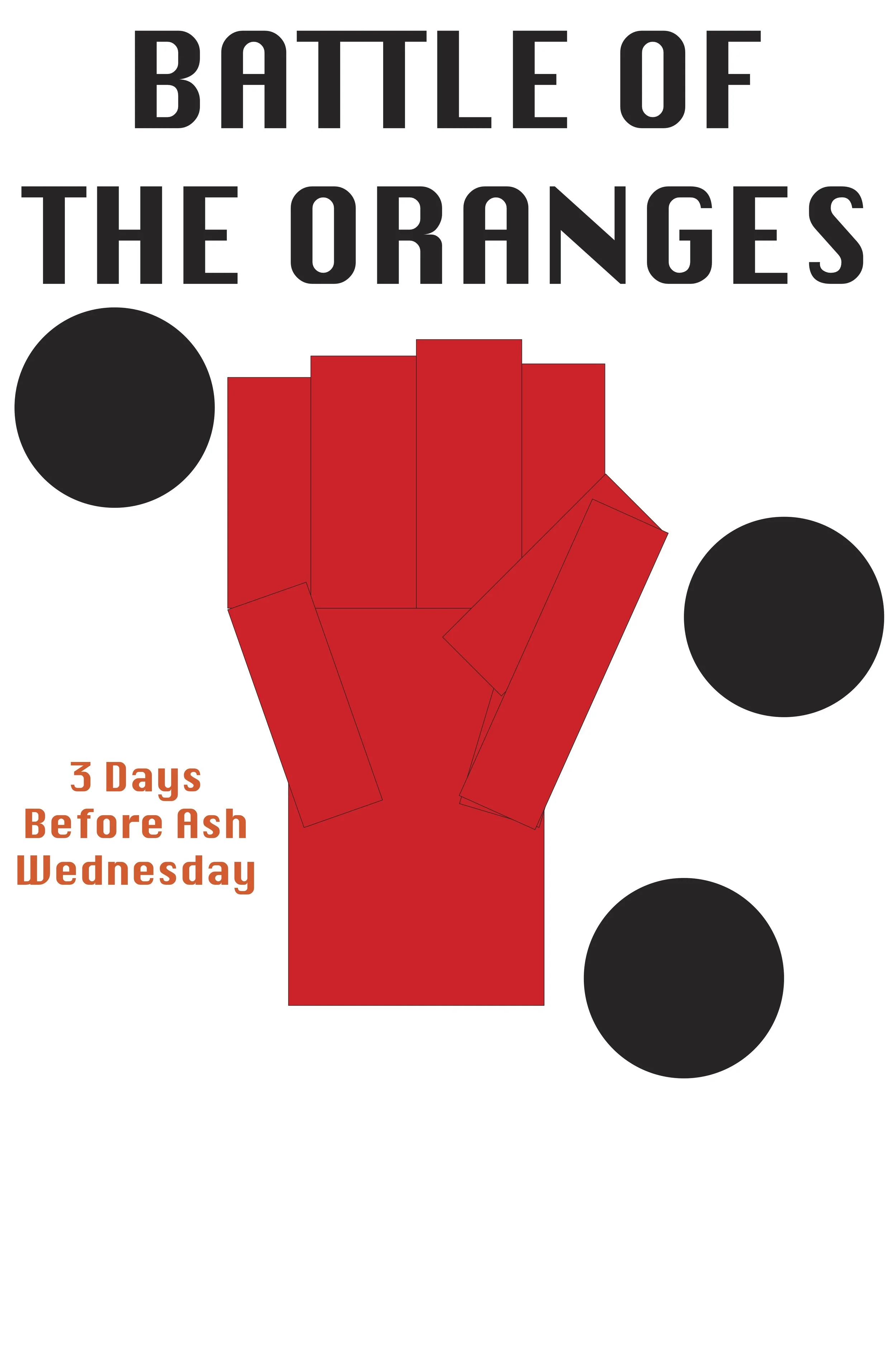
Old Design

The old design featured much more angular text and focused heavily on the center visual, which took up much of the poster space.
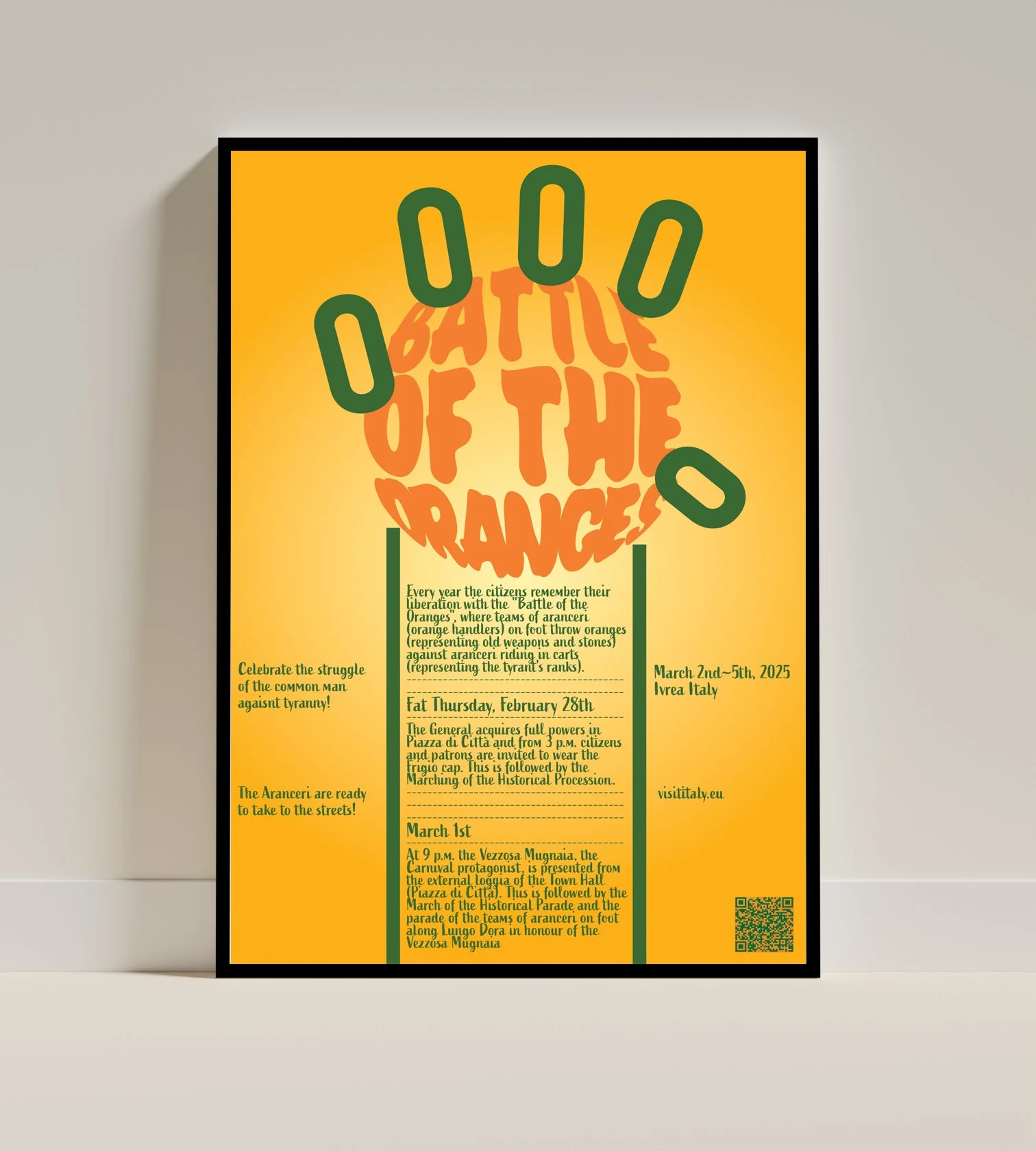
reDesign

The new design incorporates the text into the central image design. This allows for the text to take up more room and appear more visually prevalent. This allows for both the image and the information to be conveyed as the central focus of the design.


Pictured below is the project at multiple stages throughout its development.