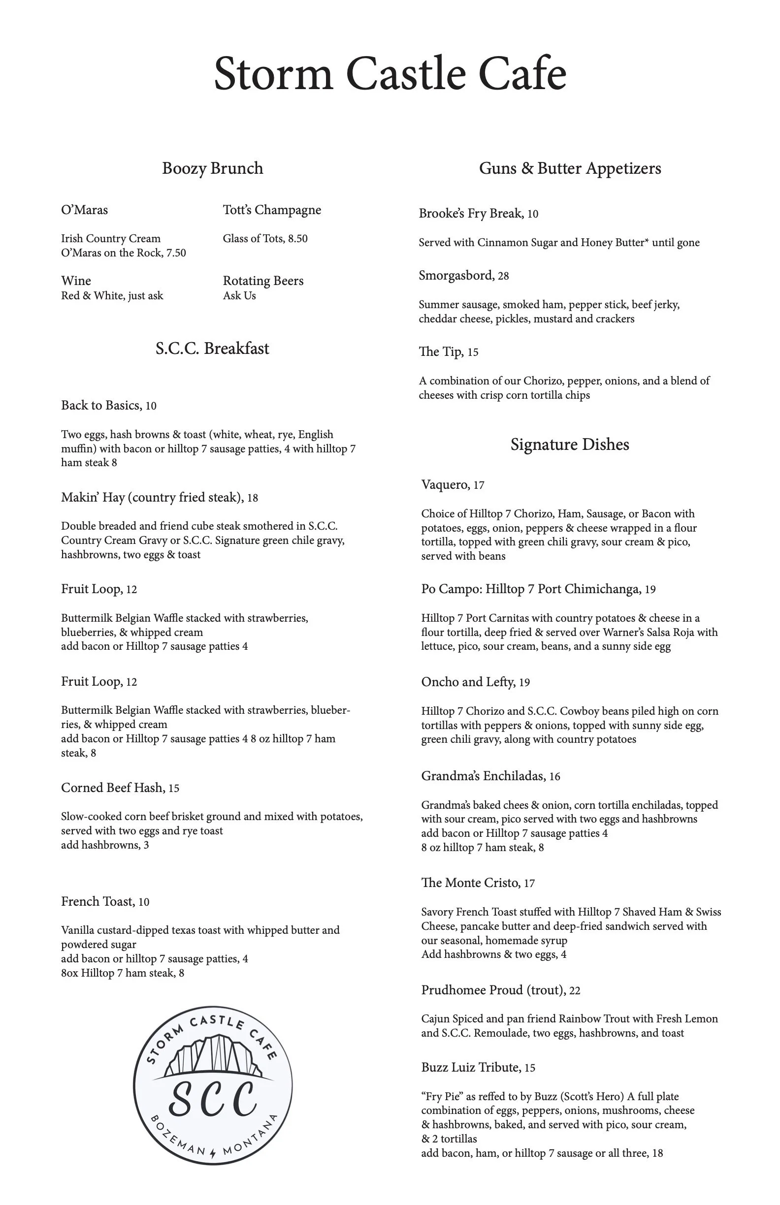
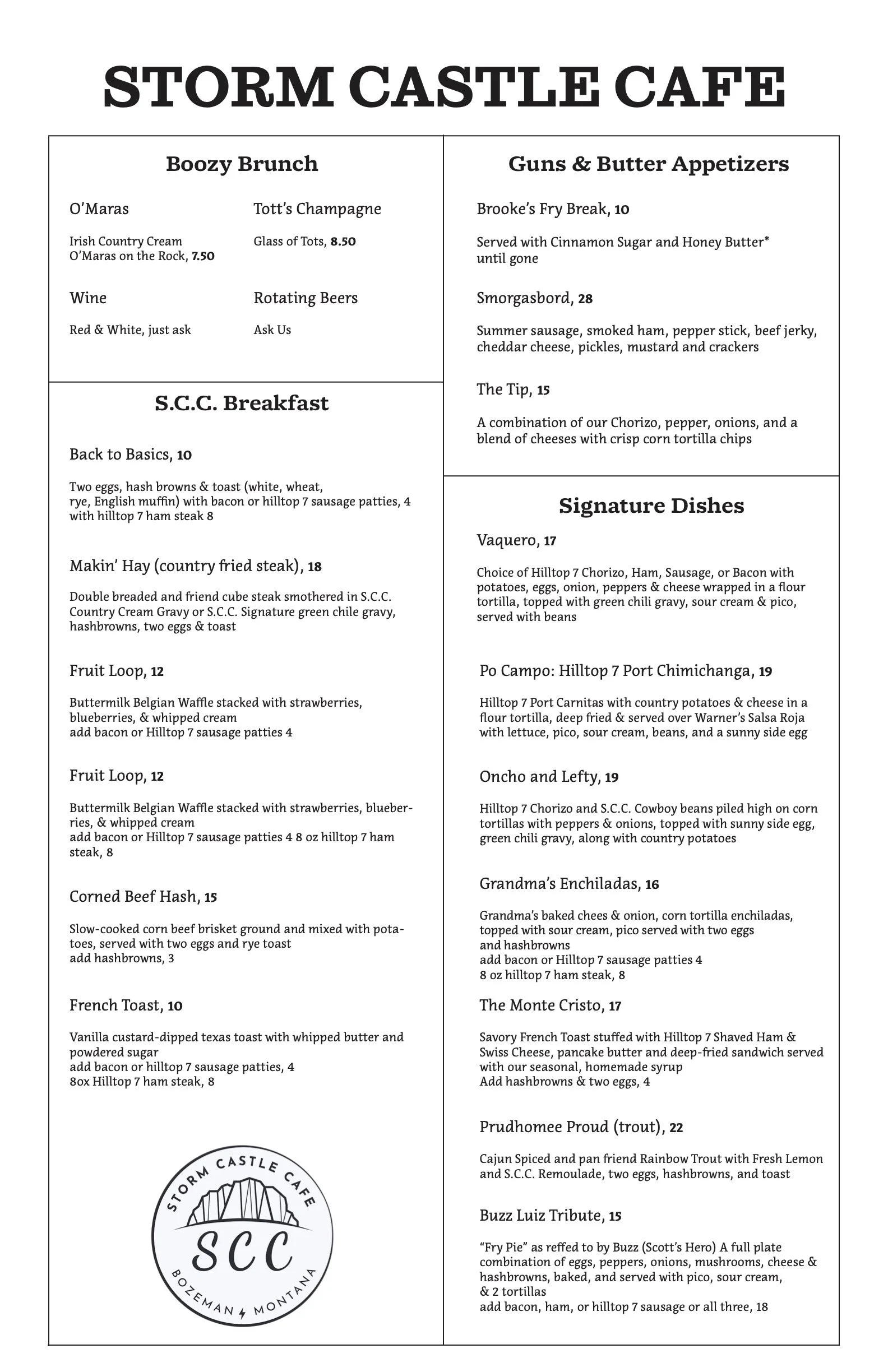
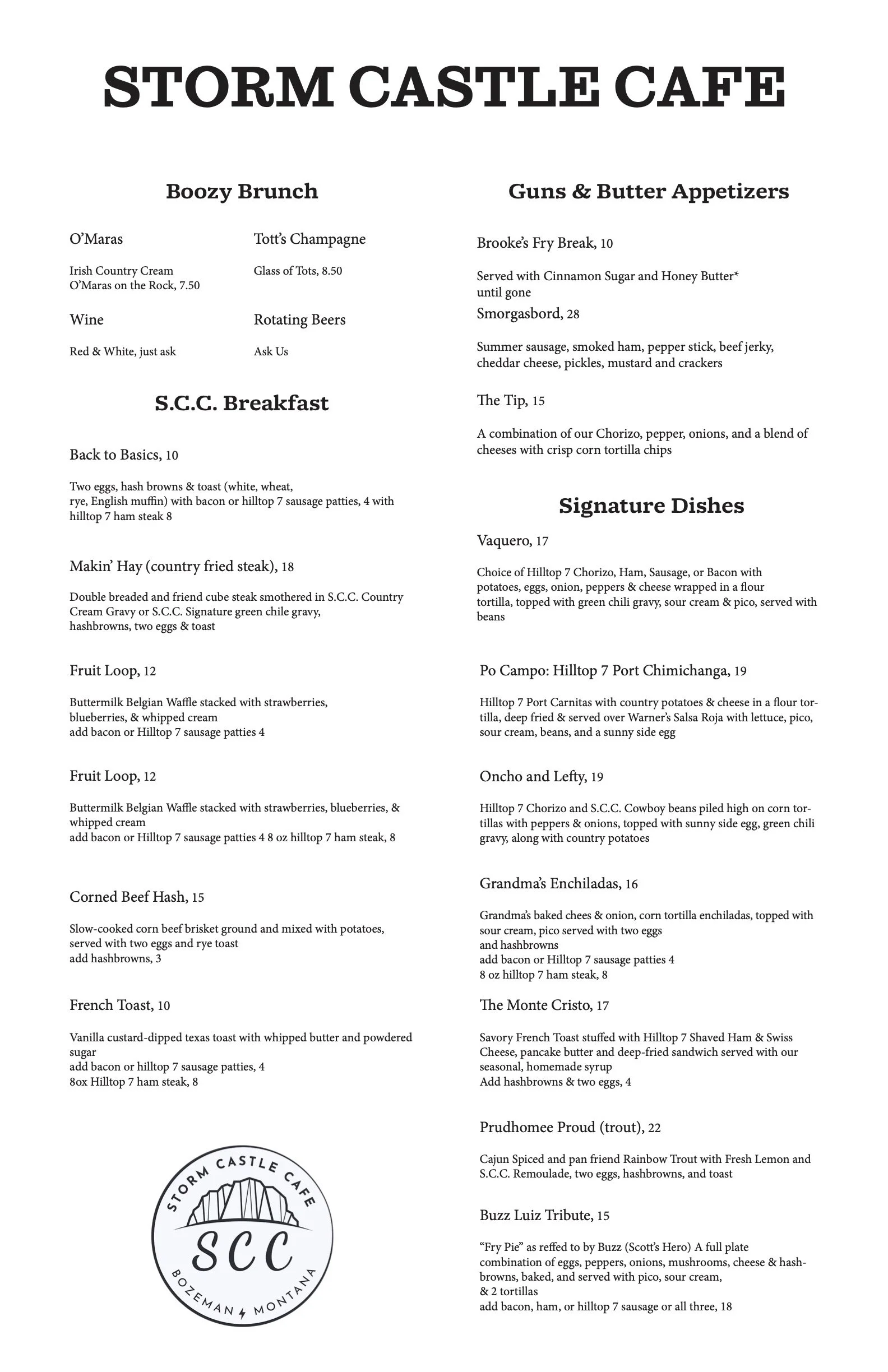
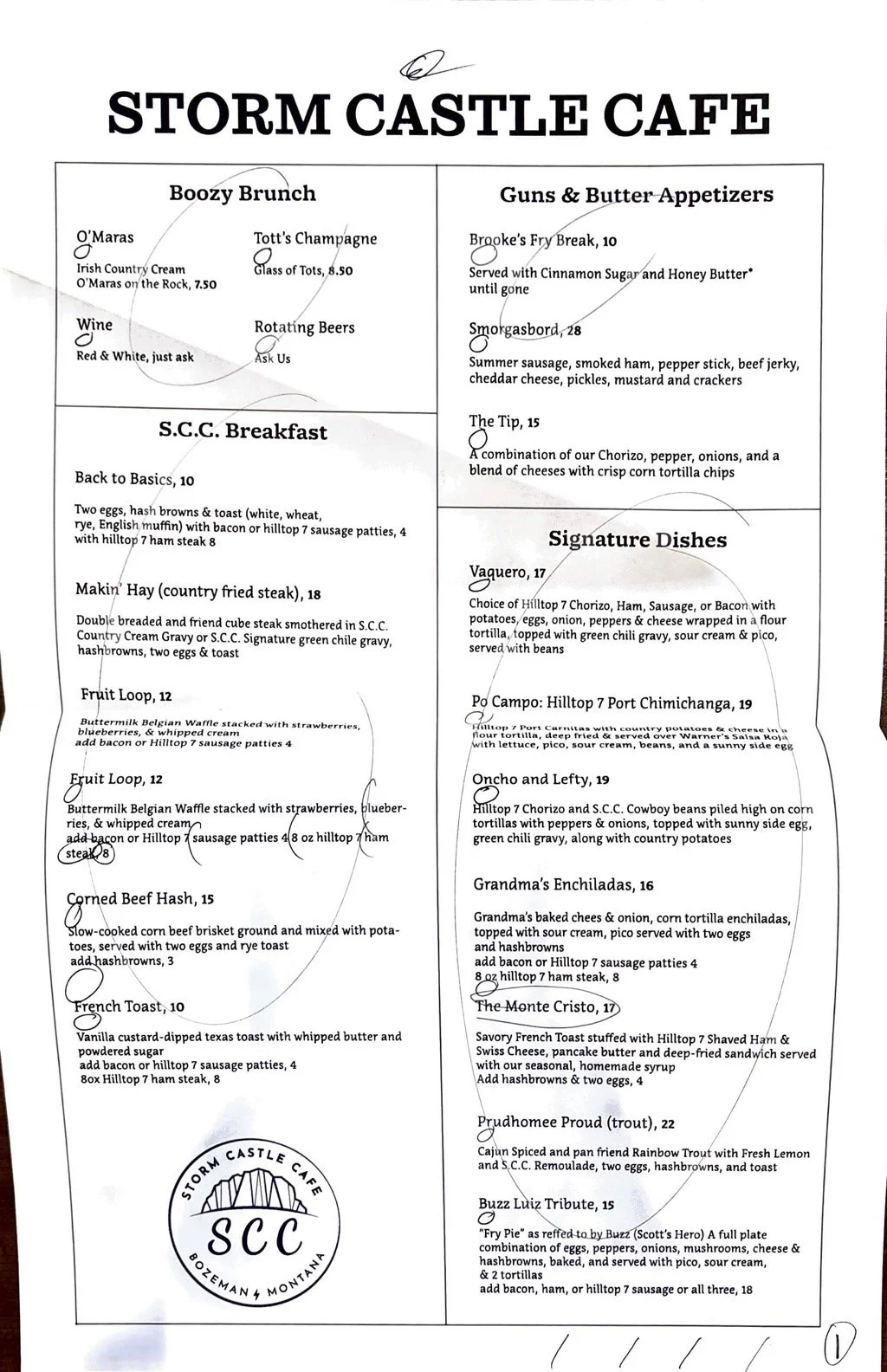
Menu Design
For this project I focused on the basics like hierarchy and the importance of fonts to reinforce the design. I created two more "minimalist" designs as I felt that it would be more accurate to the restaurants feel and the original menu design, as to not break too far from the owners original intentions. Using simple thin lines to reinforce the groupings on the menu. The biggest challenge over the course of the project was keeping it simple yet not having it feel "under-designed" and struck a good balance towards the end.


Pictured below is the project at multiple stages throughout its development.