Magazine Reboot
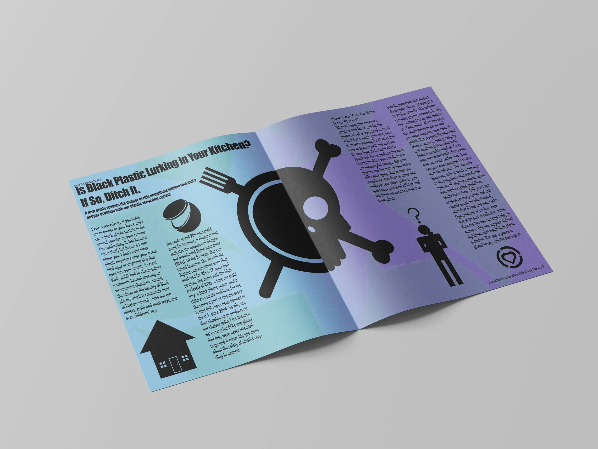
When starting this design I created two distinct sections on the page, one that had more of a scientific research feeling to it, while the other had a toxic feeling to it to highlight the main point of the article. As such the whole spread was designed over a light blue that faded into a purple towards the right side of the page to create this effect. To further this idea, at the center there is a half dinner plate half skull image to grab the reader's attention. The skull is surrounded by the recycling imagery to point the reader towards the text of the page. Other iconography surrounds the text but directly relates to the nearby information provided to keep the reader engaged.


Pictured below is the project at multiple stages throughout its development.


