Album Cover
For this project I used mostly grayscale color schemes to highlight the parts that actually used color. This was also to highlight the themes of duality, to have a colder atmosphere juxtaposed with a warmer figure. Using energetic line work to capture a sense of motion in my cover. By doing this my cover was able to appear less flat and convey that motion to the audience. My piece has a central figure for both the front and the back, to make it clear what the audience should be focused on. The front and back are related by being the same scene just from a different perspective, one as looking at the climber and the other being from the perspective of the climber.

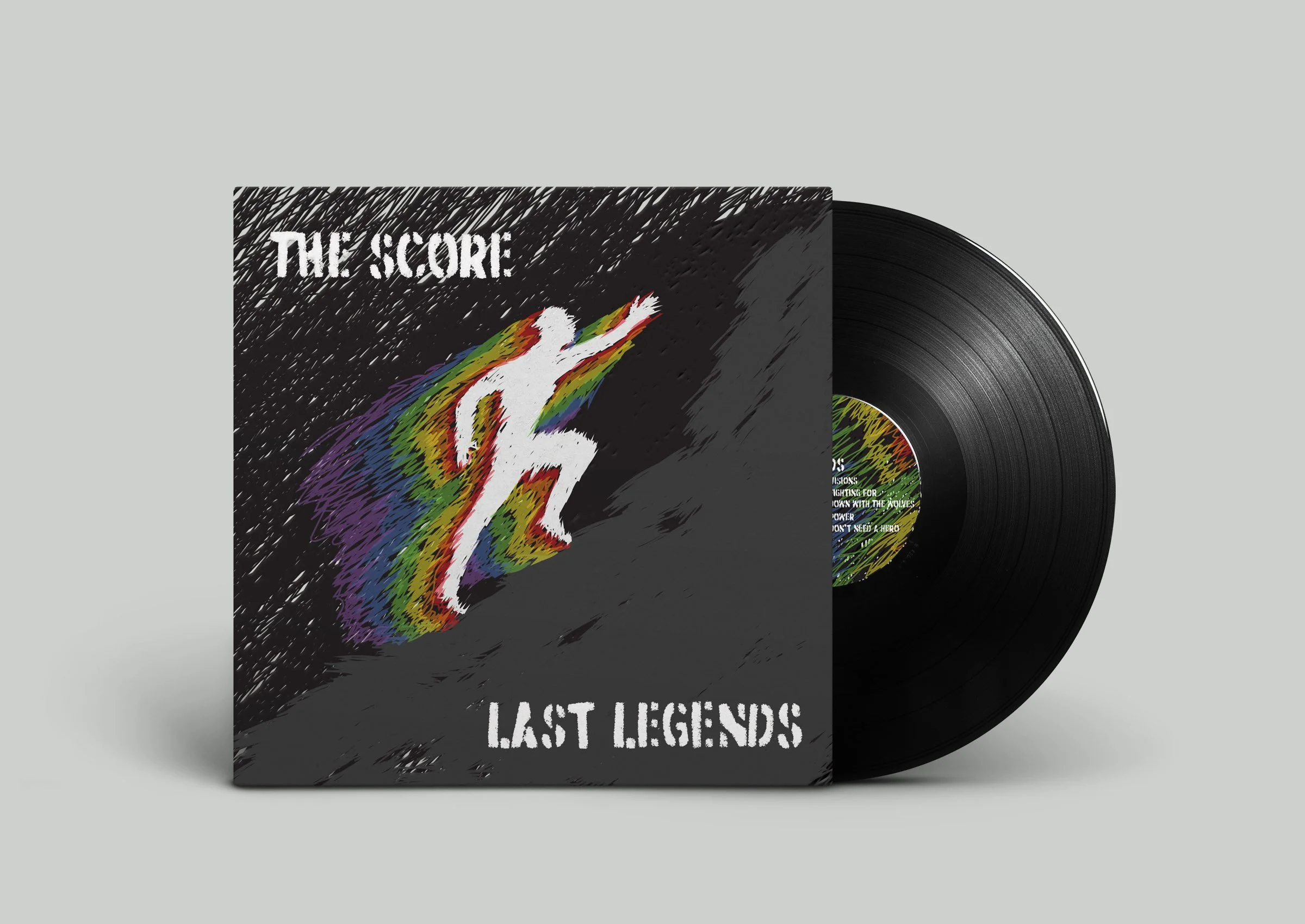
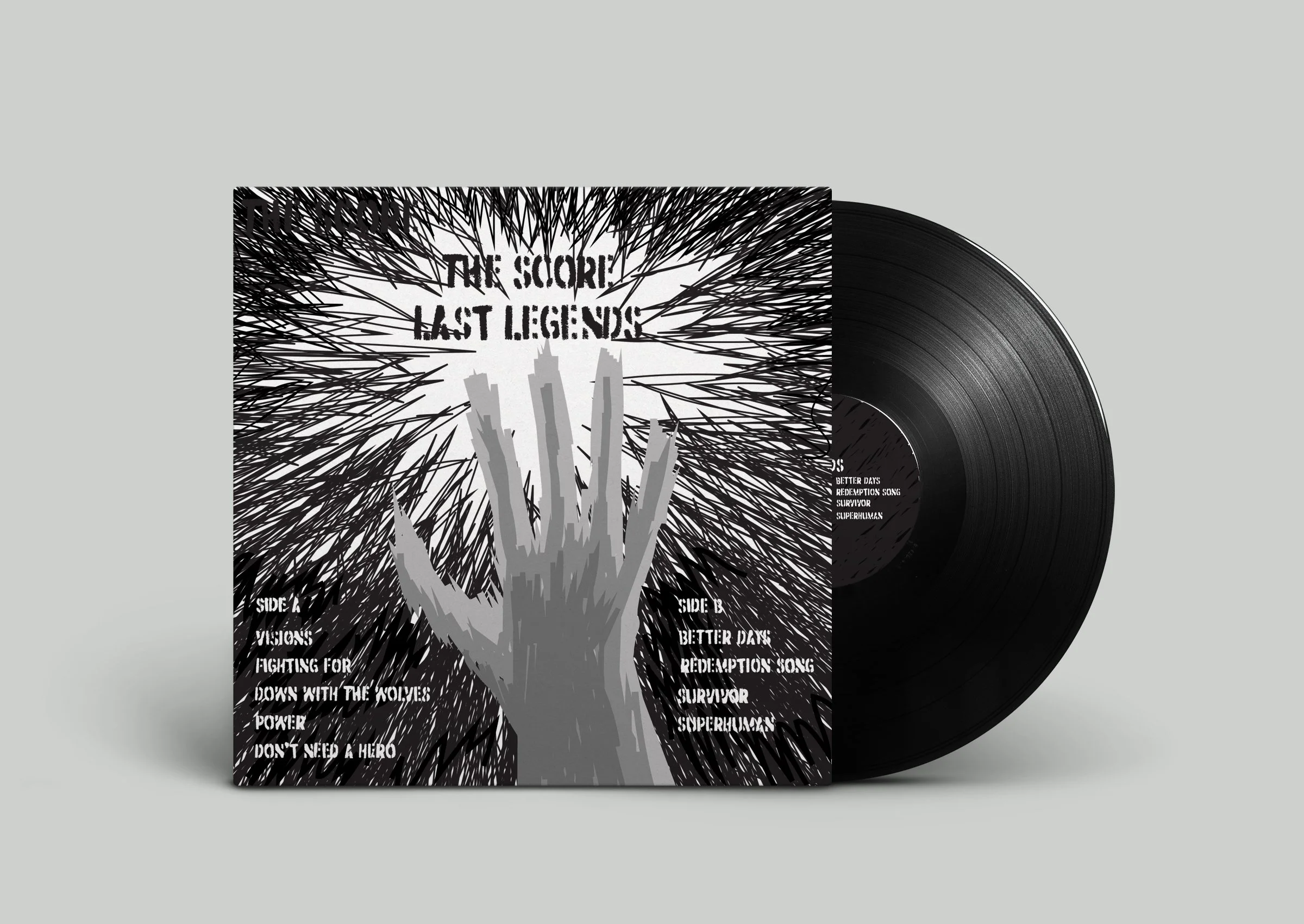
The juxtaposition of having one side contain color and another completely greyscale creates a sense of contrast between the two, further pushing a sense of duality. In addition, the cover being the only color on the application draws your attention to it, giving the sense that the song is providing an energy.

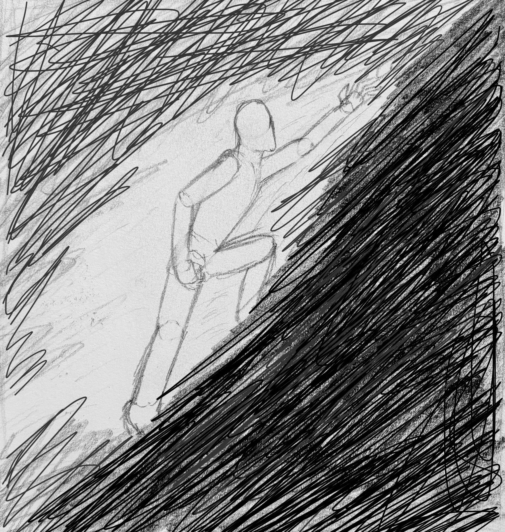
Pictured below is the project at multiple stages throughout its development.


