US City Branding
My design is emblematic of how many people view New York City as an ideal rather than a place. Most people think of New York City as a place of innovation and forward progress, pushing the boundaries of what’s known. While during my research I found many cool and interesting facts about New York I would’ve liked to implement. However, I didn’t want to cast away that ideal of New York, so I created my logo with the idea other people could imprint their own images onto it. Despite this, the whole logo is built on a cube, referencing the shape of a building to connect it to New York City further.


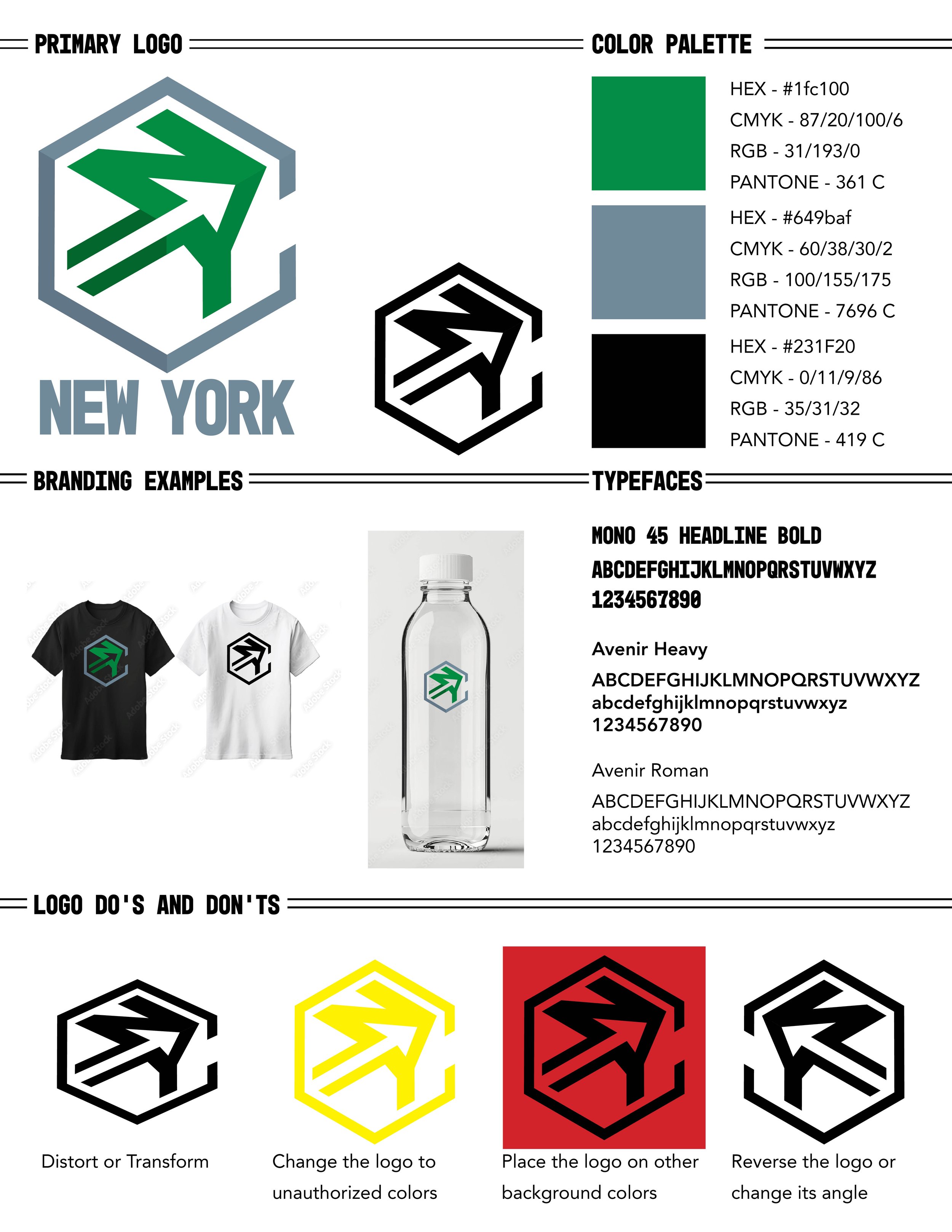
Primary Color Logo
Black & White Logo

Envelope

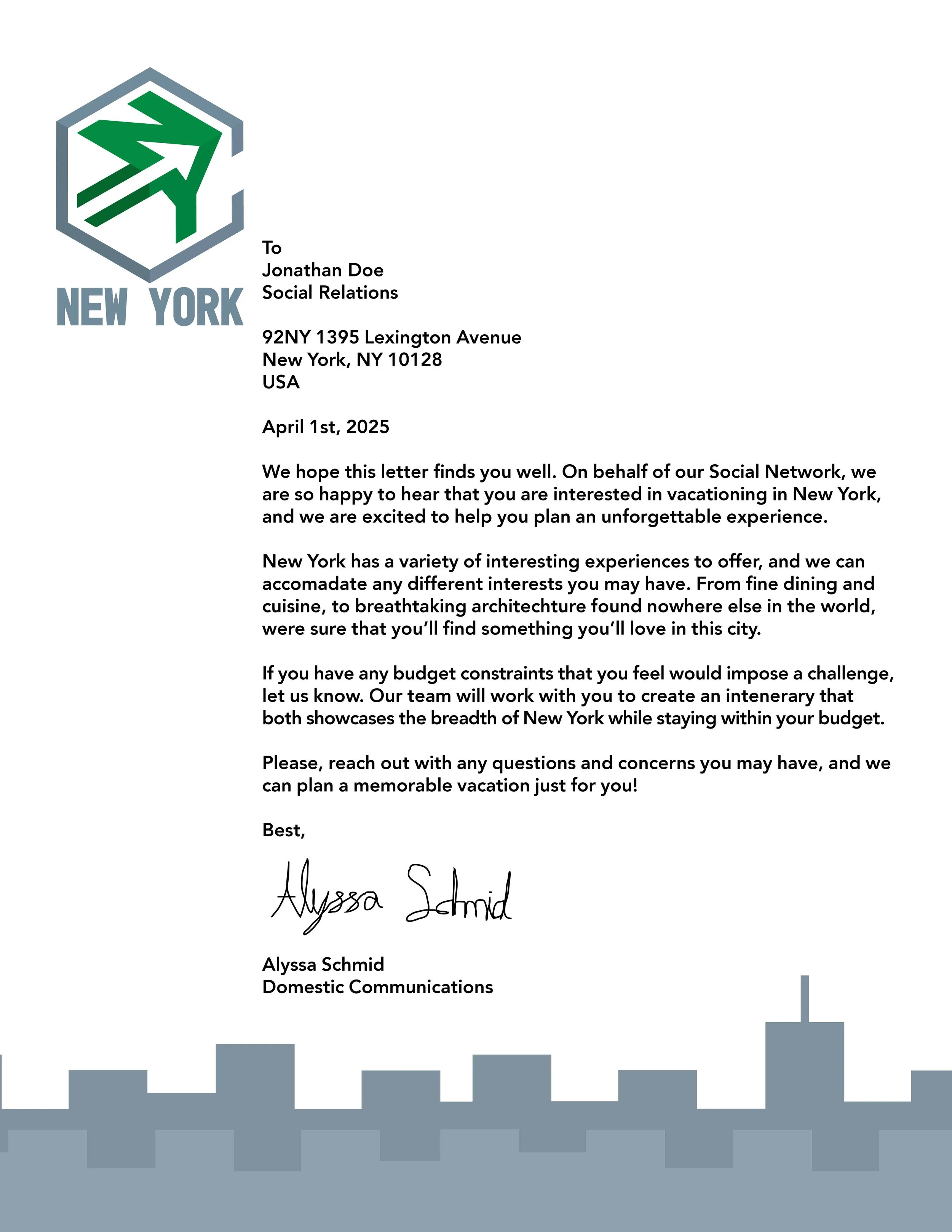
Letterhead
Logo Instructions
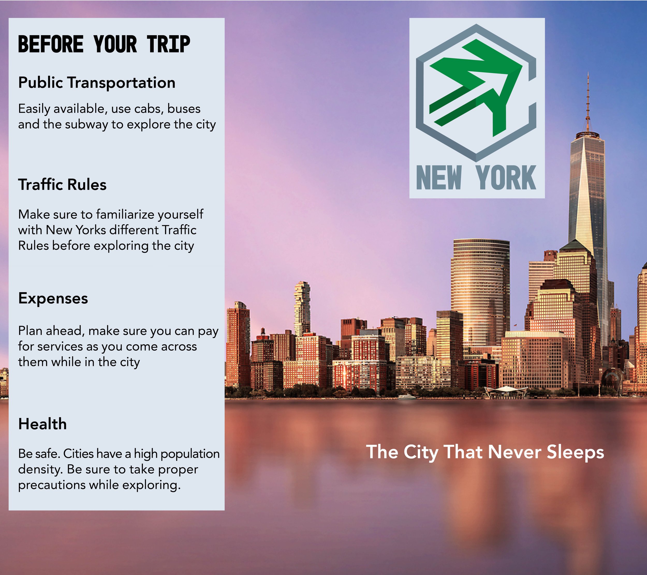
Brochure Outside
Business Card

Brochure Inside


Pictured below is the project at multiple stages throughout its development.


